Dog & Spoon

Challenge
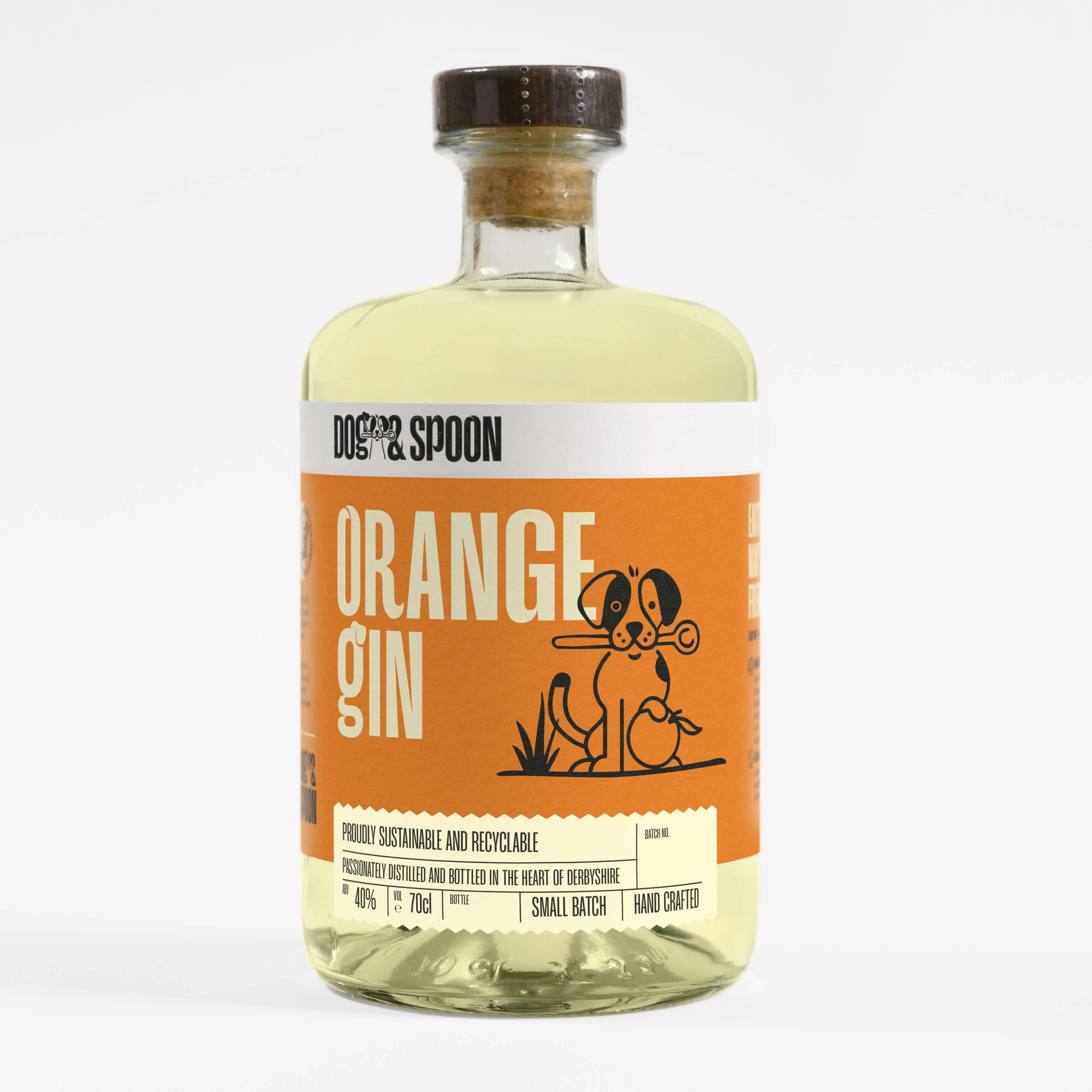
Dog & Spoon are a Derbyshire based distillery that have been producing incredible spirits for many years, but they faced a number of challenges with their existing packaging. Number one was their concept. Outside of their existing logo, the motif of "Dog and Spoon" was not being capitalised on. It was replaced with a confusing "science project" concept. Second was complexity. Their label solution was made up of 4 individual labels that needed individual application by hand. This desperately needed streamlining into one core label. The final one was their sustainability message, which felt more like an afterthought. As a Carbon Neutral brand, this was a major USP that needed to be shouted about.
Solution
Our solution saw us bring back the dogs in a major way. We developed a new brand character that retained some well loved characteristics of their previous logo. This new character had major benefits including stronger proportions, more emotion and a full body option. From there we were able to develop a range of illustrations in various playful circumstances, to bolster the brand's packaging. In addition to this, a bespoke typeface was created to allow "doggy" glyphs to be introduced into product names, as well as key messaging across their marketing materials. To tackle complexity, we developed a single custom die-cut label that simultaneously improved application whilst helping the product feel significantly more premium. Finally, with sustainability, we put the message at the heart of the new labels, with it featuring in the batch label as well as a dedicated section on the label's right wing, promoting the brand's various initiatives
Recognition